Poor Design.
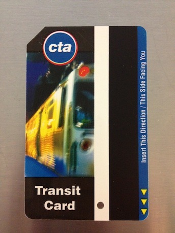
What’s the most important element on this Chicago Transit (‘L’) card? It’s that tiny strip running down the right side, telling the user how to insert the card.
A good design would make how you’re supposed to use the card the central focus, instead of a photo.
Usability should take priority over aesthetics. Ask any first-time 'L’ rider.
